Configurable dashboards plus an agent that answers "how's the data doing?" with charts.
Drag-arrangeable analytics dashboard backed by seven live PostgreSQL RPCs running in parallel, plus the Data Analysis Agent — a chat panel that takes "how complete is the catalog by category?" and renders an inline chart with the answer, then optionally rearranges the dashboard itself.
The problem
PIM analytics, when it exists at all, is a static set of charts a vendor decided you should care about. The supplier doesn’t get to ask new questions; they get to read the answers to old ones. And the data quality story (which is what suppliers actually care about) is buried in spreadsheets that none of the existing dashboards can join across.
Ember Analytics is the surface for the questions that show up every Monday: what’s my catalog completeness by category? Which retailers got publish failures last week? How many SKUs are missing hero images? — and a way to ask new questions in plain English when the dashboard hasn’t anticipated them.
What I built
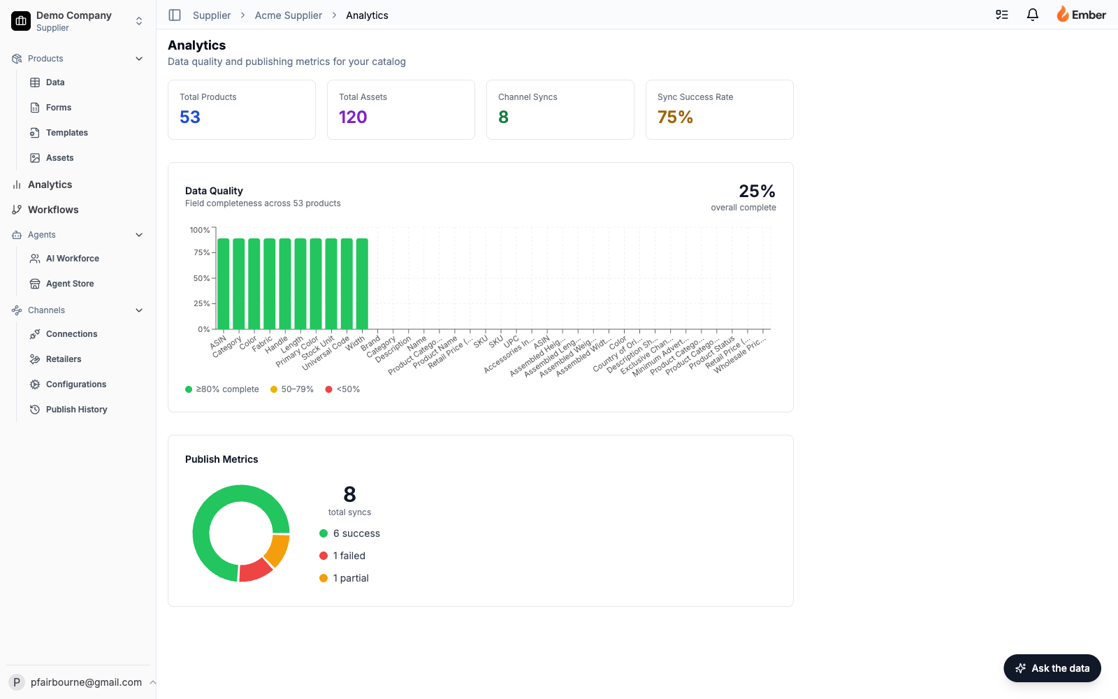
A widget dashboard at /supplier/[slug]/analytics, with seven live data sources running in parallel, drag-arrangeable widget layout, and a sidecar Data Analysis Agent that can both answer ad-hoc questions and modify the dashboard.
Seven live data sources, fetched in parallel via Promise.all():
- Data quality metrics — per-field completeness across the catalog, via
get_data_quality_metricsPostgres RPC. - Publish metrics — per-channel success/failure counts, via
get_publish_metricsRPC. - Product count — total SKUs (
count: 'exact'). - Asset count — total image assets.
- Category breakdown — grouped product count by category.
- Tasks — status + priority breakdown from the tasks table.
- Asset completeness — per-SKU coverage of required asset types (hero image, spec sheet, lifestyle shot, etc.), via
get_asset_completenessRPC.
All seven run as PostgreSQL functions executing inside the database, not as JavaScript loops over rows fetched to the application server. The page renders fully when the slowest of the seven returns, not the sum of all seven.
Widget system — Widget configurations live in an analytics_page_configs row with a widgets JSONB column. Available widget types are typed as a union (summary_cards | data_quality | publish_metrics | category_breakdown | task_summary | asset_completeness). The dashboard ships defaults; each user reorders via drag-and-drop powered by @dnd-kit/core + @dnd-kit/sortable. The new layout writes back to Postgres. Reload preserves it.
Charting — Recharts handles every visualization. Bar charts for time-series and counts. Pie charts for breakdowns. Responsive containers that auto-scale to the widget’s grid cell. Every chart is a real React component; there’s no canvas hack or screenshot trick.
The Data Analysis Agent — a floating chat panel (“Ask the data”) in the bottom-right corner of the dashboard. Submits { question, companyId, currentWidgets, history } to /api/agent/analyze/analytics. The agent returns:
answer— natural-language explanation.chart— an optionalChartSpecJSON object ({ type: 'bar', title, data: [{label, value}] }or{ type: 'pie', title, data: [{name, value}] }) that the client renders inline using the same Recharts components the dashboard uses.actions— a list of dashboard side-effects the agent wants to perform:apply_filter,widgets_changed, etc.
When the agent answers “you’re missing assets for 23% of your tools category,” the chart shows up directly in the chat. When the user says “add asset completeness to the dashboard,” the agent returns a widgets_changed action and the dashboard reorders itself, with the new layout persisted.
Challenges it solves
Static dashboards don’t fit dynamic catalogs. A supplier with 12 categories doesn’t want the same dashboard as one with 200 retailers. The widget-per-user model means each user lands on a dashboard they configured. New widget types ship with one new union member and one new component — the framework around them doesn’t need a rewrite.
Data analysis usually means waiting for a data team. “Can you pull a report on category-level asset gaps?” is a sentence that earns a 24-hour SLA at most companies. The Data Analysis Agent kills that sentence. The agent has the same RPCs the dashboard does — get_data_quality_metrics, get_asset_completeness, etc. — plus enough tools to query the products and tasks tables directly. Asked a question it can answer, it answers. Asked a question outside its scope, it says so.
Aggregate queries that would punish the app server. Seven independent aggregate metrics fetched as a JavaScript Promise.all on parsed rows would slow the page to a crawl. Running them as Postgres RPCs (SELECT ... GROUP BY ... returning aggregates) keeps the work in the database where the engine and indexes live. Page time-to-render stays under 200ms even on large catalogs.
Agent-driven UI mutation without injection risk. The agent can rearrange the dashboard, but only by returning a typed widgets_changed action that the client validates against the known widget-type union before writing back to the database. The agent can’t ask the dashboard to render a <script> tag because the dashboard doesn’t have a code path that would.
Inline chart rendering without an LLM rendering hack. The agent doesn’t return SVG or HTML; it returns a typed ChartSpec JSON object. The client renders it through the same Recharts components the dashboard uses. Charts in the chat are the same charts on the dashboard, with the same hover-state, color palette, and responsive sizing.
Why it matters
This surface turns Ember from a “PIM with reports” into a “platform with a data team built in.” The economics:
- Ad-hoc analytics ship without a data engineer. Every question a supplier would have hired a consultant to answer (or built their own dashboard for) lives behind the floating chat panel. The agent reads the same RPCs the dashboard does — no new infrastructure per question.
- Configurable layouts kill the “I only need three of these widgets” objection. Users hide widgets they don’t care about and surface the ones they do. Dashboard adoption goes up because the dashboard is theirs, not the vendor’s.
- Real-time quality signal drives the rest of the platform. The asset-completeness number isn’t just a chart; it’s the input to the prioritization engine that tells the Enrichment Agent what to work on next.
Key metrics
- Time-to-first-chart. From dashboard load to first widget render. Target: under 200ms on a 10k-SKU catalog. RPC-based aggregation puts this well under target.
- Agent question-answer ratio. Questions the Data Analysis Agent answered without saying “I can’t” / total questions. High = the tool catalog is well-fitted; low = there’s a tool to add.
- Dashboard reconfiguration rate. Percent of users who reordered widgets within their first session. High = the default is wrong; low = the default is fine, or users aren’t engaging.
- Chart-spec parse-failure rate. When the agent returns a malformed
ChartSpec, the client logs it. Should be effectively zero in steady state. - Time-to-insight on critical metrics. How long after a publish failure shows up in
publish_historydoes it appear on the dashboard? Should be sub-second — the dashboard reads live, not from a materialized view.
Why this is successful
The thing that makes this surface durable, not just useful:
The agent and the dashboard share infrastructure. They consume the same RPCs, render through the same chart components, and persist layout state in the same table. The agent isn’t a separate code path; it’s a shortcut to the same primitives the dashboard already exposes.
The dashboard is a database query plan, not an ORM walk. Aggregates run as RPC functions. The application server doesn’t iterate rows. Postgres does what Postgres is good at; the app does what the app is good at.
The widget union is closed. Every available widget type is a union member. Adding a new one requires both a type and a renderer; missing either is a compile-time error. The agent can’t ask for a widget that doesn’t exist; the client can’t render a widget the system hasn’t declared. Refactors are cheap because the type system enforces the contract.
This is the surface that makes Ember feel like a product that pays attention to what’s in the catalog, not one that just stores it.